Type of project:
Academic project
Durations:
Mar. 2023 - Jan. 2024
Scope:
User Research
Strategy
Prototyping
Testing
About the project
The challenge
As a team, we're focusing on new parents who seek help and connection. They're looking for a single place to find advice, connect with trusted experts, discover baby-friendly activities, places, and find recommended products.
The goal
Our project aims to simplify life for new parents by providing a caring and safe solution. By adopting a user-centered design approach, we can identify the best solutions to their challenges.
The solution
We provide a mobile app that consolidates all the essential insights we've gathered from our research. Why we choose a mobile app? It's clear that, at the beginning of parenthood, a parent often holds their infant in one hand, leaving only the other hand free for use.
02 User research
1.Research methods: IDIs :
2.I conducted 4 IDI (with 2 mothers and 2 fathers)
and in 2 I was observer.
8
mothers
5
fathers
26-42
age rage
2-12 mth old
baby’s age rage
04 User persona
Sara, 29
Lives in Kraków, married
first child, Hanna, 9 months old
Bio
Sara, a vibrant first-time mom, adores her healthy baby girl but feels drained by the constant focus on childcare. An outgoing sports enthusiast, she misses the physical activity and social connection that sports brought into her life.
Goals & needs
wants to keep balance between a role as a mother and her own personal interests\wants to go back to being active
wants to know if the place where she is going is accessible for mothers with baby
Alex, 38
Lives in Wrocław, has a partner
first child, Martin, 6 months old
Bio
Alex is a first-time father who' is highly committed to being an involved parent. He sees the importance of shared responsibility in parenting and wants to participate in caring for his newborn son.
Goals & needs
wants to be an involved father
would love to create a strong bond with his son and contribute to childcare responsibilities
seeks for a community among other fathers that encourages and celebrates this kind of engagement
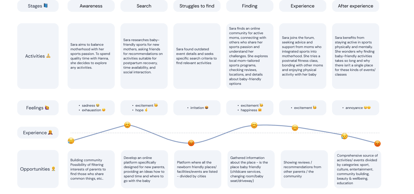
Here I want to show Sara’s experience journey map, a potential user striving to balance her love for sports with parenthood, how she tries solve it and how can we help her.
06 Top competitors
Description
Preglife Connect" is a mobile app supporting expectant mothers with features and resources for each stage of pregnancy. It fosters community connections among moms-to-be, providing a comprehensive and informative platform.
In what field we may compeed
community
knowledge
forum (interactions among users)
tags
Description
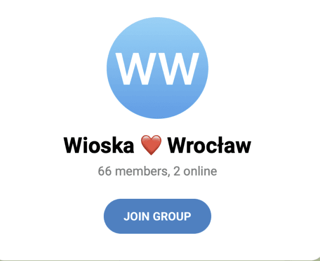
Agnieszka Konefał initiated 'Woman Villages' ('Wioski Kobiet') on Telegram, creating safe online spaces for women in Poland. Modeled after the supportive spirit of traditional villages, it serves as city-specific forums for women to seek help and support from one another..
the concept of the “village approach” - strong community

Description
Facebook, a widely used social media app, connects millions worldwide. Users create personal profiles, connect with friends, join groups, follow pages, and engage in conversations through comments and likes..
creating events and meetups
07 Conclusion and Final idea
Our final idea was to design an app with recommendations created by parents for parents based on a templates which can be displayed on the map with pins. There is no such solution available on the market and our research showed that new parents could deeply benefit from it. We also wanted to provide ability to connect with others within app as there is such a big need for community in this target group.
COMMUNITY:
Parents' Circle
connections
groups
II. Mutual recommendations
acitvities
places
knowledge sources
specialists
products
other users
08 Development plan - MVP
Phase 01 - we are here
Minimum Viable Product
Polish market
Android app
II. Community:
∙ Connecting with others [online]
∙ Meetups [offline]
∙ Ensuring security
III. Recommendations / adding
∙ Places
∙ Activities
Phase 02 - further development
of features
Community
Groups
II. Recommendations:
∙ Specialist
∙ Knowledge
∙ Products
Phase 03- hitting the final stage
Foreign markets
iOS app
II. Recommendations feature
Managing activities within the app
09 Wireflows
Goal:
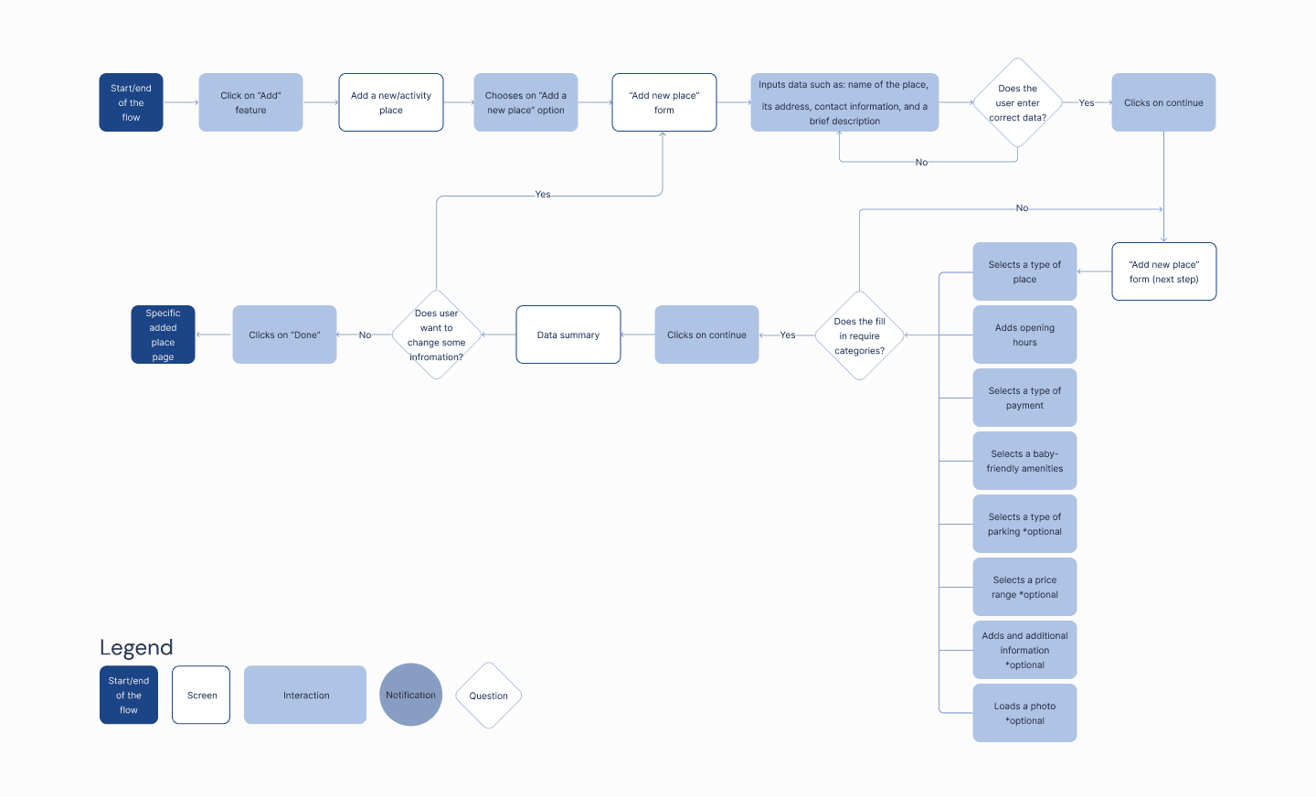
Sara wants to share her positive experience of discovering a baby-friendly café with other parents through the Parents Up app.
Motivation:
Willing to help other parents who may face similar challenges, such as finding a suitable place with access for a parent with a baby.
10 Wireframes
We have created 5 paper wireframe flows to each wireflow.
At this stage I have mainly focused on "adding new place" and "creating a meetup" user flow but also actively participated in creating others.
11 Prototype - MidFidelity
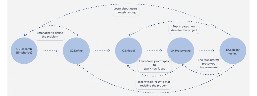
After modifications and brainstorming sessions, we finally created the first clickable prototype version of the ParentsUp! application, which correspond to our previously developed assumptions.
12 UI design
Aa
Inter
Font - Inter
Typography
01.
#F1F4F9
02.
#AFC3E5
03.
#7291C5
04.
#1B2438
Primary colors
05.
#3478F5
06.
#1FC2CC
07.
#18BD1E
08.
#FFAB33
Secondary colors
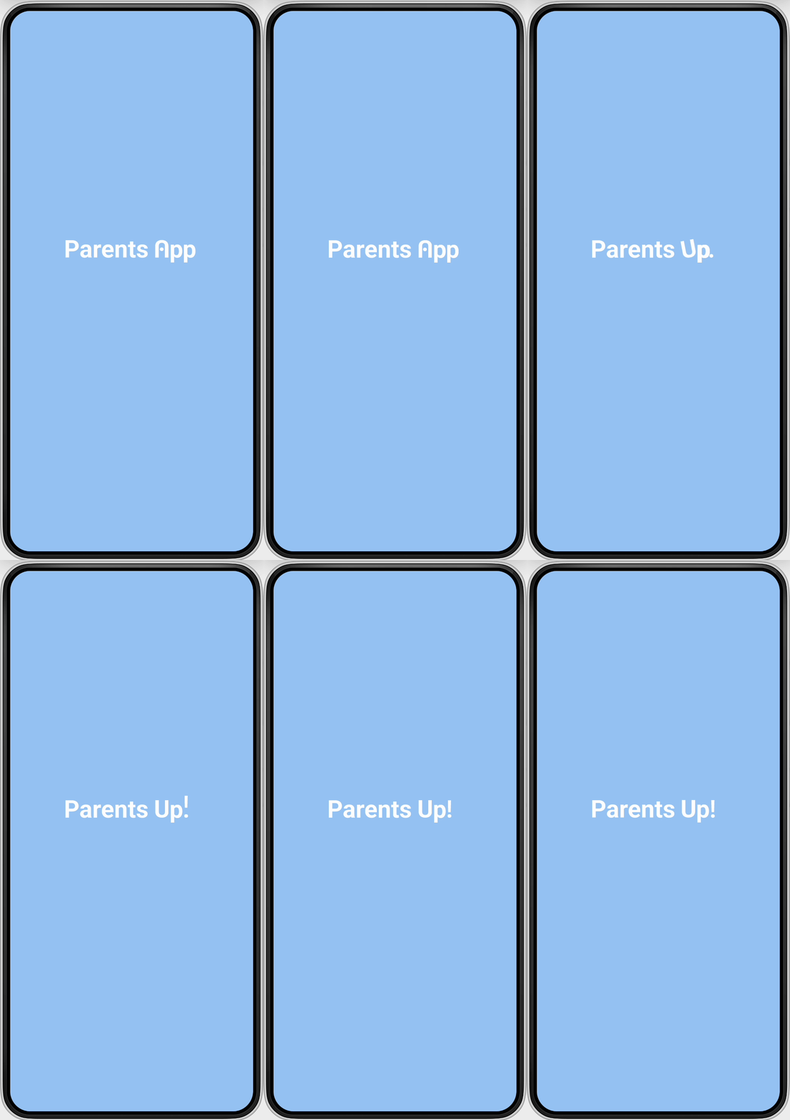
Animated logo
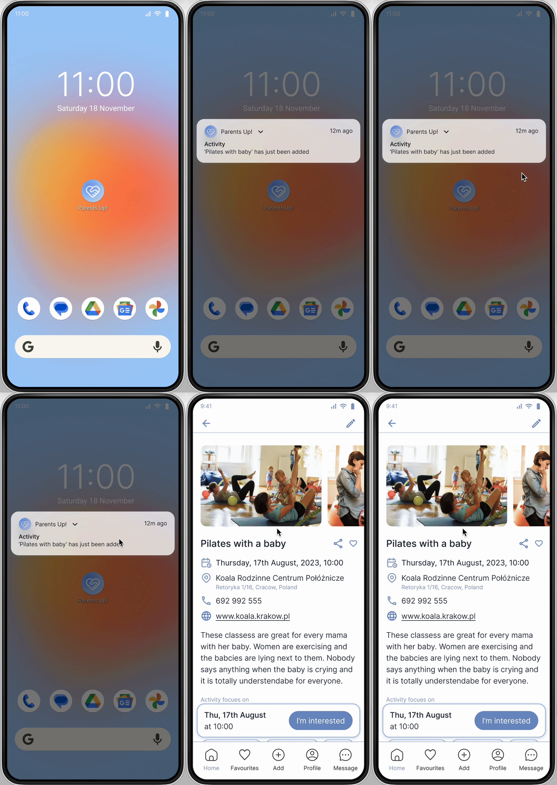
Popup notification
13 Key Features - High fidelity mockups
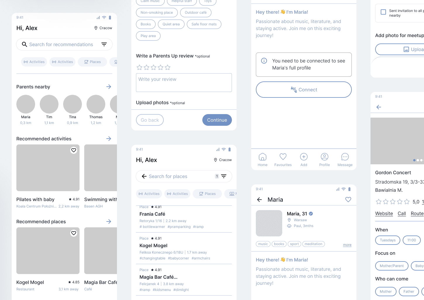
Finding / adding activities
Where parents can attend with their babies and ensuring these places are baby-friendly, including e.g. ramps for prams, or corner
for change a diaper
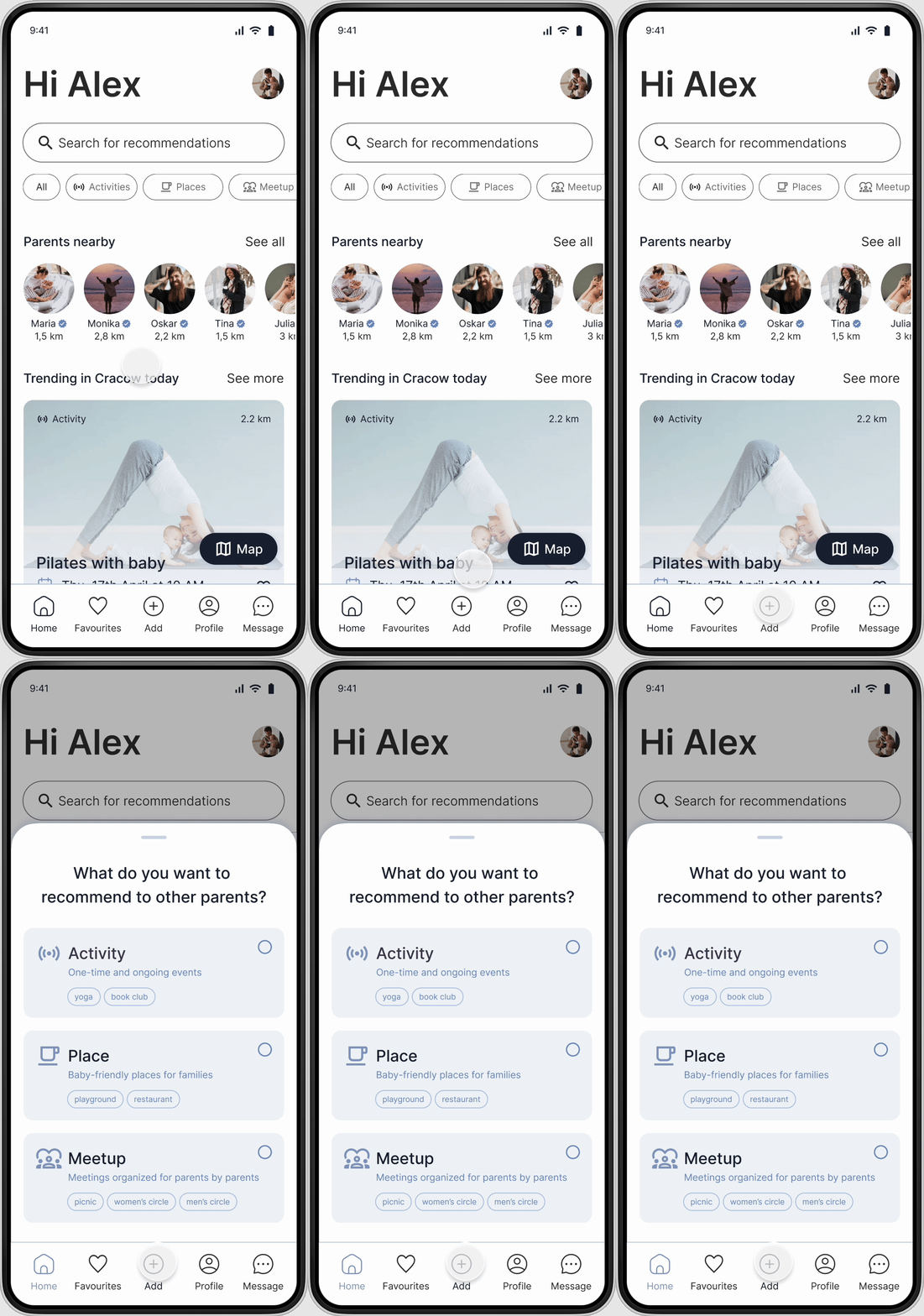
Finding / adding places
Where parents can go with their baby to keep balance between personal interests and parenthood.

Connecting with other parents
To share similar interests and discovering their recommendations
to save time and creating meetups to connect and share time with others fellow parents.

14 Usability testing
The main aim of usability testing was the first verification of the created prototype by potential users and, as a result, to prepare recommendations of how to solve problems encountered by respondents.
The tasks included looking for a baby friendly place and a baby friendly activity, showing interest in taking part in an activity, adding a place, looking for another parent and messaging them and adding a meetup.
After usability tests we created affinity diagram to organize big amount of feedback and come up with solutions.
10
users
🤖
Android users
🏡
Living in Poland
Critical:
too many similar elements on the homepage
confusion between “meetup” and “activity”
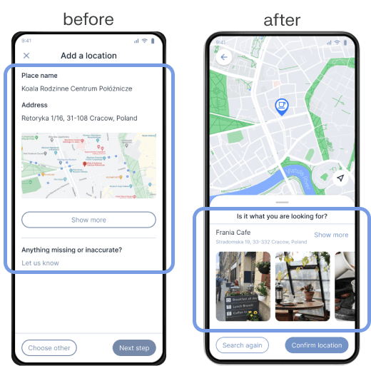
information about place taken from Google Maps was not intuitive
inviting users to a meetup was confusing
template for meetup was not intuitive
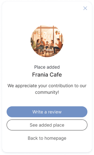
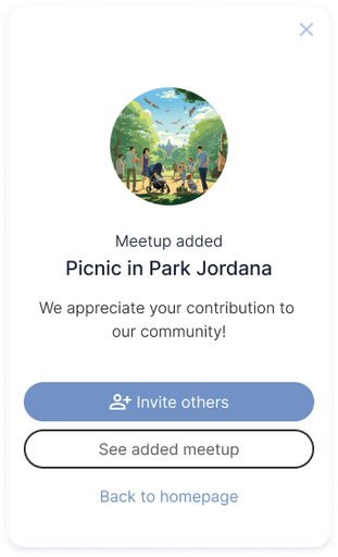
there was no confirmation after adding a place/meetup/activity
“I am interested” button in a meetup needs to be clearer what is it for
II. Relevant:
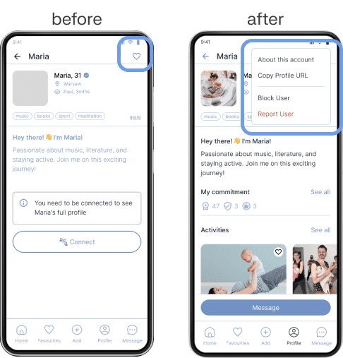
there is a confusion between “connect”, “wave” and “message” in user profiles
there was pointed the need for safety by having a “report user” option if necessary
“confirm” button while choosing correct place from Google Maps was confusing for users as they thought that it is the end of the flow
III. Low impact:
confusion caused by the absence of a "step navigation bar" that would typically provide clear guidance on their current position within a process.
adding tags in meetup was not intuitive

15 Result of design
After many hours of working on the prototype we managed improve it substantively and visually!
Onboarding process
ParentsUp! provides such features as:
discover baby-friendly activities, places in parents’ surroundings
joining to meetups
share experiences with other fellow parents

Security
Safety for parents by:
blurring faces of parents for not sign up users
parents are not displayed on the map
badges
report system
verification system

"Add" feature
Parent can add a recommendations such as:
activity
place
meetup.
To prevent a cognitive load during “add”, we simplified this process as much is possible by:
quick adding
templates
tags (to help to find users what they are looking for quicker)
supported by google maps

"User profile"
Parent has everything in one place:
connections
saved places
meetups
private calendar (can be connected with Google Calendar)
On the user's profile we can check which badges the user has and thus verify the safety of the user.

"Smart recommedations"
Our homepage provides:
personalised recommendations
based on parent’s interests
based on location
shows e.g. trending activity in parents’ surrounding

"Searching"
In our application, searching is simplified into five category:
all
activity
places
meetup
parent
Each category has advanced filters for more convenient searching. You can browse through the list or use the map feature where pins are placed based on location for easy navigation.
In addition, you can check what events are in another city.

17 Learnings
Designing this app showed me how important is user research and conducting IDI’s session - we may think that we know what users want but actually not really. Making it with such with attention to detail later brought many ideas how we can help our target group.
Making this project in a group was really challenging (as it was created fully remotely) but also (and maybe the most important) showed me how to communicate my ideas, defend them, find a common ground and divide our work as equally as it was possible.
The customer experience journey map and value proposition canvas process provided a comprehensive view of the user's experience, enabling us to identify touchpoints and potential areas for improvement - helped me think holistically during project.
Research revealed the numerous challenges that new parents face, prompting us to rethink our approach. Our ambitious project scope was narrowed thanks to MVP, teaching us how to prioritize product features in a business context, focusing on what's most important at the start and what can wait for the future.
18 Next steps
Collaboration with Development Team
Hold a kickoff meeting to discuss design specifications with developers.
Establish communication and set up a project management tool for tracking.
Official Launch and Monitoring
Release the app on the Play Store and monitor reviews, ratings, and performance.
Respond to feedback and provide regular update
